Olly is a mobile app aimed to address several pain points for children with Autism Spectrum Disorder (ASD). Its primary goal is to enhance communication and provide tools to help the child navigate through the world.
Olly caters to two distinct user categories: caregivers (CG) and children with ASD. Each user group experiences the app differently, with the aim of providing tailored experiences to meet their specific needs and challenges.
100% of this project was done by Adam Lundblad (2021)
I had to factor in not only the complexities of childhood and adolescent development but also addressed the distinct challenges associated with ASD. Overcoming this required extensive research and multiple design iterations to create a solution that was both effective and accessible for users on the spectrum.
Primary research combined interviews and surveys to gather insights. Professionals in special education and psychiatry were interviewed, while surveys were distributed to parents and caregivers.
*Please note that the following screens do not outline full features or flows, and only serve to get a better holistic view of the project. If you would like to see the full project, please request the UX architect guide.


The UX development encompassed several essential steps: constructing a business case, crafting research-based personas, creating a site map, and defining a feature set. Throughout this process, two distinct user categories emerged: individuals with ASD (Autism Spectrum Disorder) and caregivers (CGs).


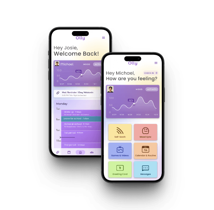
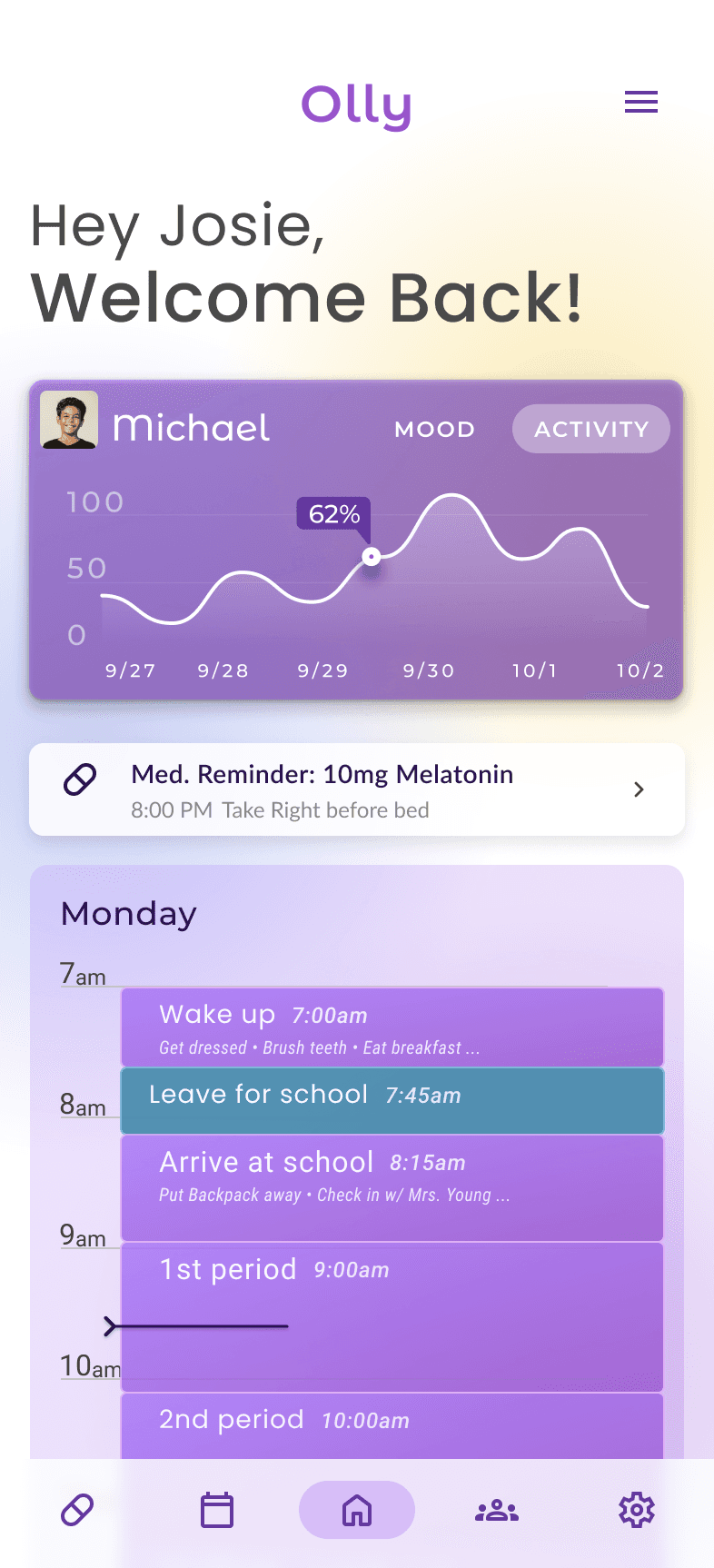
The ASD app experience focuses on addressing specific challenges and pain points faced by children with ASD. The caregiver app is designed to monitor the child's mood and activity, assist in managing ASD-related challenges, and provide helpful tools and resources for caregiving.


The goal for the visual design was to be playful and dynamic, appealing to the broad age range of ASD users while maintaining visual consistency with the caregiver (CG) app. The design focused on a clean, straightforward aesthetic, providing clear, actionable insights on the child’s activities. To ensure consistency across both apps and streamline project management, I limited the color palette, relying heavily on the primary purple and its variants. This approach created a unified experience for both ASD and CG users while helping with design efficiency.


I aimed for the icons in the child's app to be distinct and engaging. Initially, though effective on their own, they clashed on-screen, creating a cartoonish effect. Subsequent iterations resolved this, achieving better cohesion with the overall design.
V1: I wanted to go for a 2.5D look with lots of color.This version was fun, but aesthetically it clashed.
V3: I kept the fun colors, but created icons that were more cohesive together


This project presented numerous challenges - the wide spectrum of child and teen development, coupled with the inherent variability of ASD, made designing this application akin to aiming at a moving target.
One of the biggest lessons I learned from this project was the importance of being realistic and flexible regarding project scope, as well as managing my expectations as a product designer in alignment with business needs and available resources. Due to time constraints, conducting user tests was unfortunately not feasible, despite my belief in their importance. However, when finishing this project, I stressed the critical need for ongoing testing to refine and enhance the user experience.
Nevertheless, working on this project was an incredibly rewarding experience that provided invaluable lessons and insights.