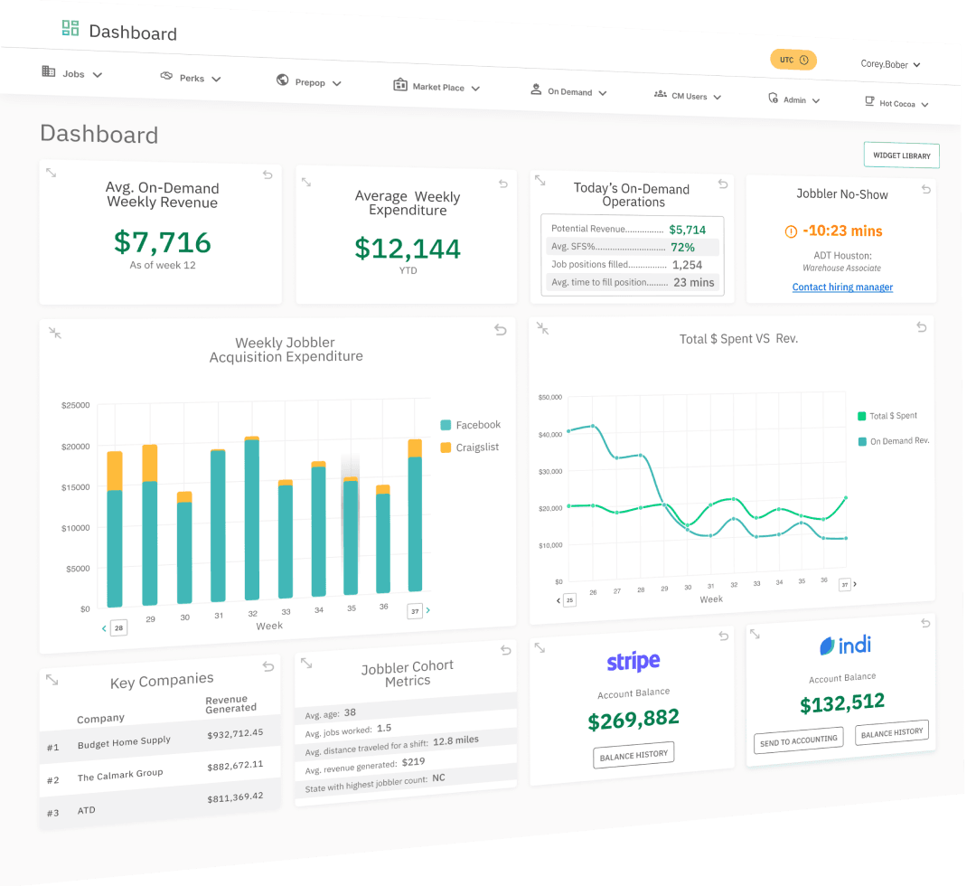
Jobble is a staffing platform catering to the gig economy, recognized among Inc Magazine's top 5,000 fastest-growing companies. However, they've encountered challenges with their back-office system, marked by unclear tables, redundancies, and extraneous data, impeding employee workflow. Initially, Jobble developed their backend platform incrementally, adapting it to evolving needs. However, rapid company expansion revealed a system ill-equipped to meet employee requirements. This led to bottlenecks, necessitating employee workarounds.
I was hired by Jobble to conduct research to identify key issues, redesign their back-end platform, and propose steps for future redesigns.
The main challenge of this project was to understand Jobble's complex business operations and gain a comprehensive understanding of their back-office platform in a short amount of time in order to redesign a more functional and efficient tool. Due to the project's tight timeline and steep learning curve, I informed stakeholders that while visual design would not be the primary focus, our efforts would prioritize improving information architecture, generating actionable insights, and enhancing the overall user experience.
In order to get up to speed as fast as possible I began by conducting interviews with C-suite and VP members to grasp the rationale behind the platform's development. Following this, I interviewed employees from various departments to uncover their pain points, the information they needed, and the workarounds they relied on to do their jobs.
When working with, or improving an existing product, conducting a heuristic evaluation is essential. Heuristic evaluation involves evaluators using established rules of thumb to assess the usability of interfaces through independent walkthroughs and reporting any issues discovered. This process enables design teams to gain valuable insights early in development and enhance product usability by adhering to established heuristics.
Improving the information architecture was a crucial for this redesign. I began by reorganizing and consolidating the On Demand navigation. The majority of pages on the back-end platform comprised data tables, which were poorly designed and required restructuring and consolidation. For this project, I adopted their existing design system.
Organizing and condensing the navigation, redesigning the main dashboard, and revamping the layout of each table and page all played crucial roles in enhancing the platform.
The original On Demand section had 21 pages, I consolidated data and pages down to 17 - reducing redundancies and combining relevant data sets. After consolidating, I reorganized and relabeled to make a more clear/intuitive navigation
For the dashboard redesign, my primary goals were to incorporate actionable insights, ensure data accuracy, and enable customization to accommodate varying needs among team members. This customization feature allows different team members to modify their view according to their specific requirements.
The project successfully achieved its goals by providing a redesigned On Demand section for Jobble's Back Office platform, significantly improving functionality and clarity. The new design adhered to proper UX design conventions, enhancing usability and alleviating some of the pain points experienced by employees.
However, there were areas where I believe I could have improved. Due to time constraints, I couldn't dedicate as much attention to visual design as I would have liked. While the project isn't client-facing and prioritizes conveying information, I often felt frustrated that I couldn't achieve the desired visual aesthetics. Additionally, the way I built Figma components, with multiple nested components, led to technical issues, causing unexpected computer crashes and loss of work, further complicating the time constraints.
Despite these challenges, I gained valuable insights from this project and am grateful to Jobble for entrusting me with this important task as a consultant.


